- cross-posted to:
- economics@lemmy.world
- cross-posted to:
- economics@lemmy.world
You must log in or # to comment.
Data is beautiful, except for when the info graphic makes the data harder to read.
Data is ugly.
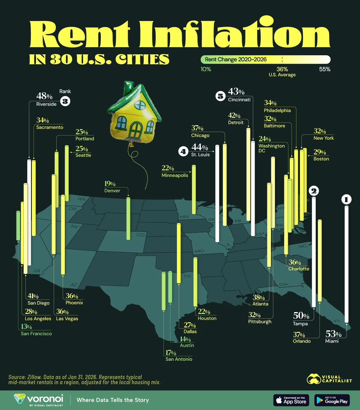
Comparatively, median sold home ptices between 2020 and 2026 increased by almost 30%, so seems like this is more of a visual of where the rental demand is.