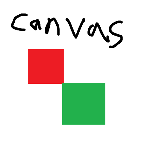
I regret not posting it before Canvas 2025, but hopefully it’ll be useful for people playing it in 2026. All letters are 5 pixels tall, and most 3 pixels wide (some 4, a few 5). I’ve also included a few Cyrillic letters and the digits.
I tried to make it even smaller, but it gets really funky.
You must log in or # to comment.
As an alternative, the 8-bit world has been doing this for a very … long … time.
deleted by creator
There’s hundreds, here’s a few tiny ones:
- https://luc.devroye.org/fonts-51468.html
- https://web.archive.org/web/20250514212230/https://robey.lag.net/2010/01/23/tiny-monospace-font.html
- https://moonbench.xyz/projects/tiny-pixel-art-fonts/
- https://littlelimit.net/misaki.htm
- https://zserge.com/posts/tiny-font/
Example of discussion on the topic:
That’s a great list, thank you! I love small fonts.
deleted by creator
I didn’t read the post and took longer than it should have to realize that the bottom half-ish are non-Roman. (Numbers are Arabic! So half!)
I… speak Russian tho (badly, non-fluently), so I should have known…
I hate how Щ looks
deleted by creator
I didn’t notice Ц in the original post, I thought it’s Ч
deleted by creator
Also the И is upside-down
deleted by creator
What is the character between
<>and¡?deleted by creator
Counter argument: This is just one style and the canvas looks better with a mix.
Many of the letters can be made a pixel slimmer, can already make a huge difference to a final look.
Sometimes it also matters what letters you actually need.
deleted by creator
Its more of a warning for over relying on established systems.
The more people experiment and make mistakes the more chance someone ends up with unique cool.
deleted by creator
deleted by creator
deleted by creator