octopus_ink@slrpnk.net to Microblog Memes@lemmy.worldEnglish · edit-28 months agoIt's almost like they knew it would just blow over.imagemessage-square22linkfedilinkarrow-up1298arrow-down125file-text
arrow-up1273arrow-down1imageIt's almost like they knew it would just blow over.octopus_ink@slrpnk.net to Microblog Memes@lemmy.worldEnglish · edit-28 months agomessage-square22linkfedilinkfile-text
minus-squarehuppakee@lemm.eelinkfedilinkEnglisharrow-up6·8 months agoPercent changed compared to 2015 would be better, but choosing a graph like this makes no sense if it would have been change yoy and also if that were the case then starting at 0% makes no sense.
minus-squareLimcon@lemmy.mllinkfedilinkEnglisharrow-up5·8 months agoI agree. The vague wording is bad, I think they should just use the absolute values and another one with the percentages, that would make it a lot clearer.
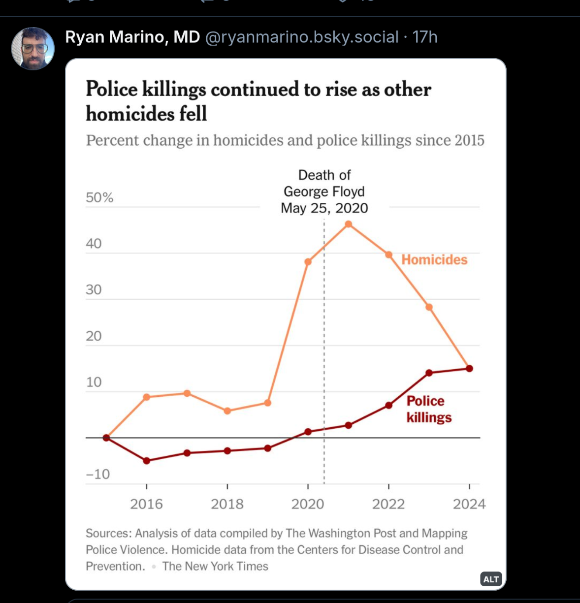
Percent changed compared to 2015 would be better, but choosing a graph like this makes no sense if it would have been change yoy and also if that were the case then starting at 0% makes no sense.
I agree.
The vague wording is bad, I think they should just use the absolute values and another one with the percentages, that would make it a lot clearer.